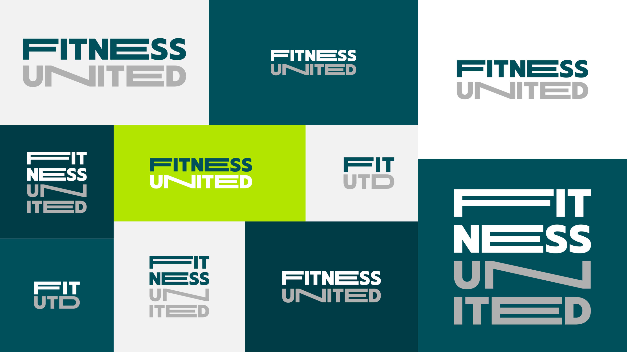
To offer as much flexibility as possible we designed three different logos: one standard logo, one small logo and one decorative logo.
The colours where chosen to give a lot of design options while keeping a strong identity.




SUBBRAND DESIGN
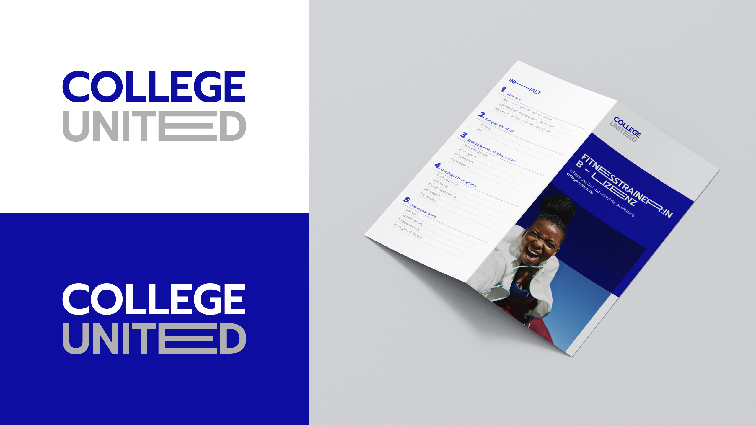
FITNESS UNITED also wanted a basic corporate design for their sub-brand COLLEGE UNITED. COLLEGE UNITED is meant to be a trainer education brand where aspiring fitness trainers can come and learn what they need to know. To keep some parallels between the sub-brand and the main brand we kept the stretch in the logo and defined primary colours which are originating in the petrol of the main brand.
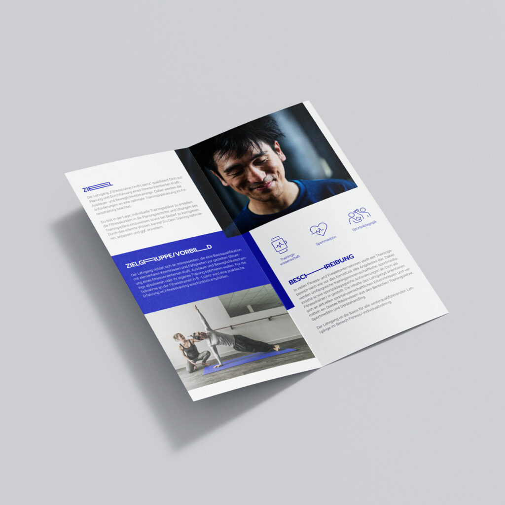
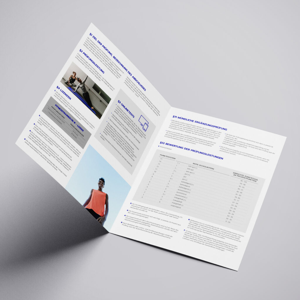
The stretch in the headlines stayed the same whereas the images, colours, fonts, and layout-structure changed.
