
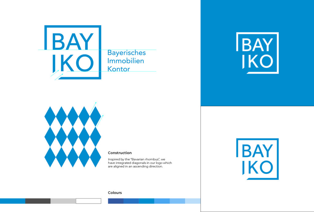
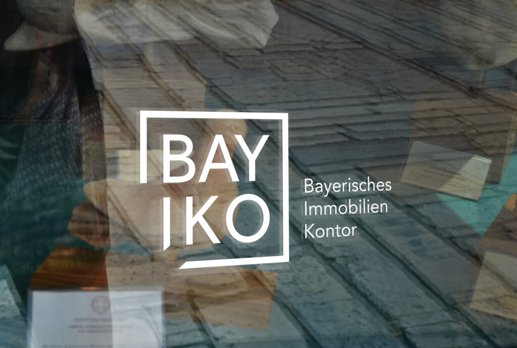
The logo was the starting point for the basic corporate design and the only element the company actually uses today.
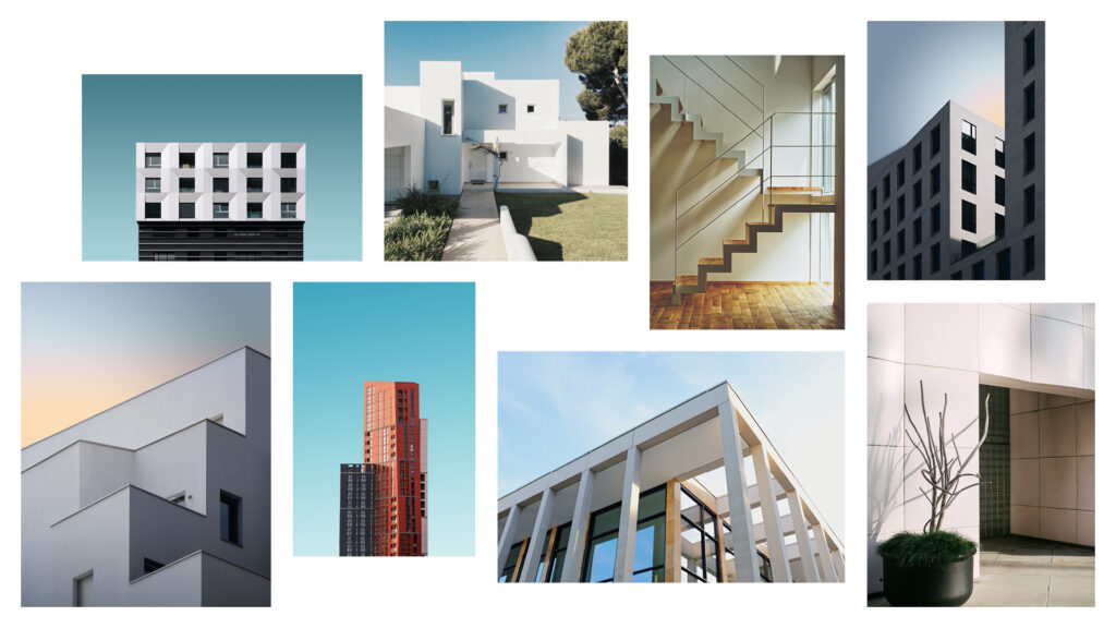
The image style was defined as minimalistic, bright and serious to give the clients the right feeling about the company. People are largely avoided in the imagery, as BAYIKOs customers do not act / buy emotionally but logically and future-oriented – this should be reflected in the imagery.
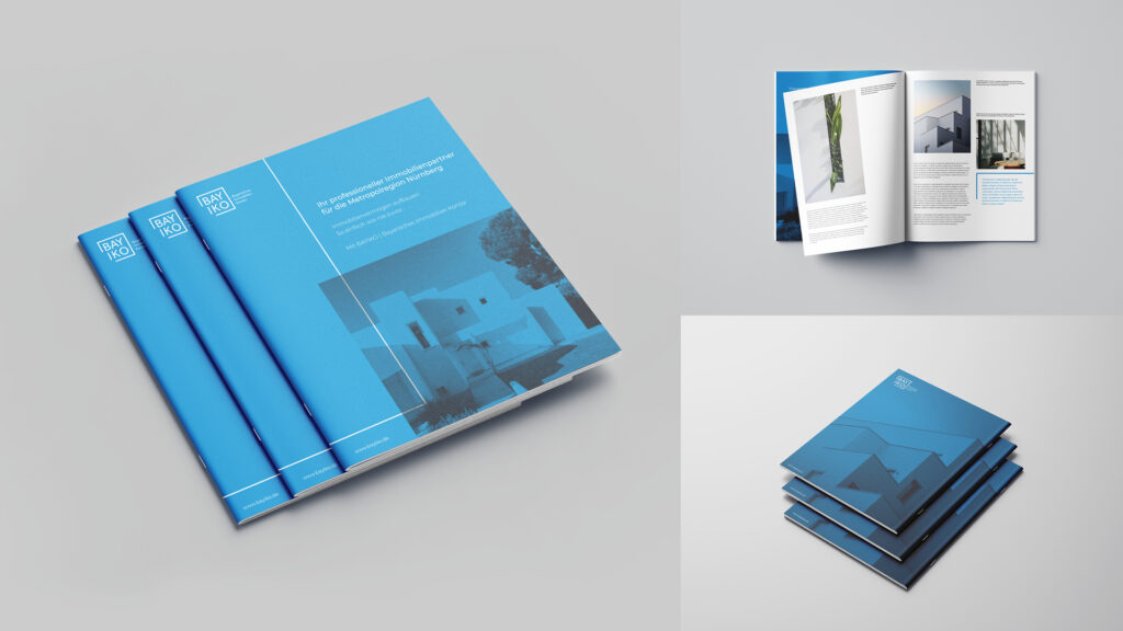
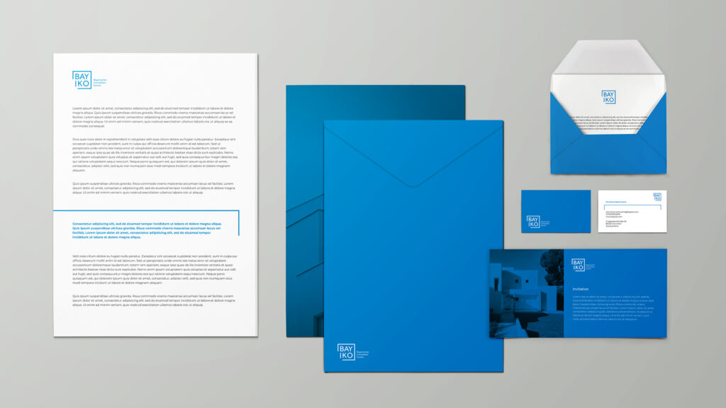
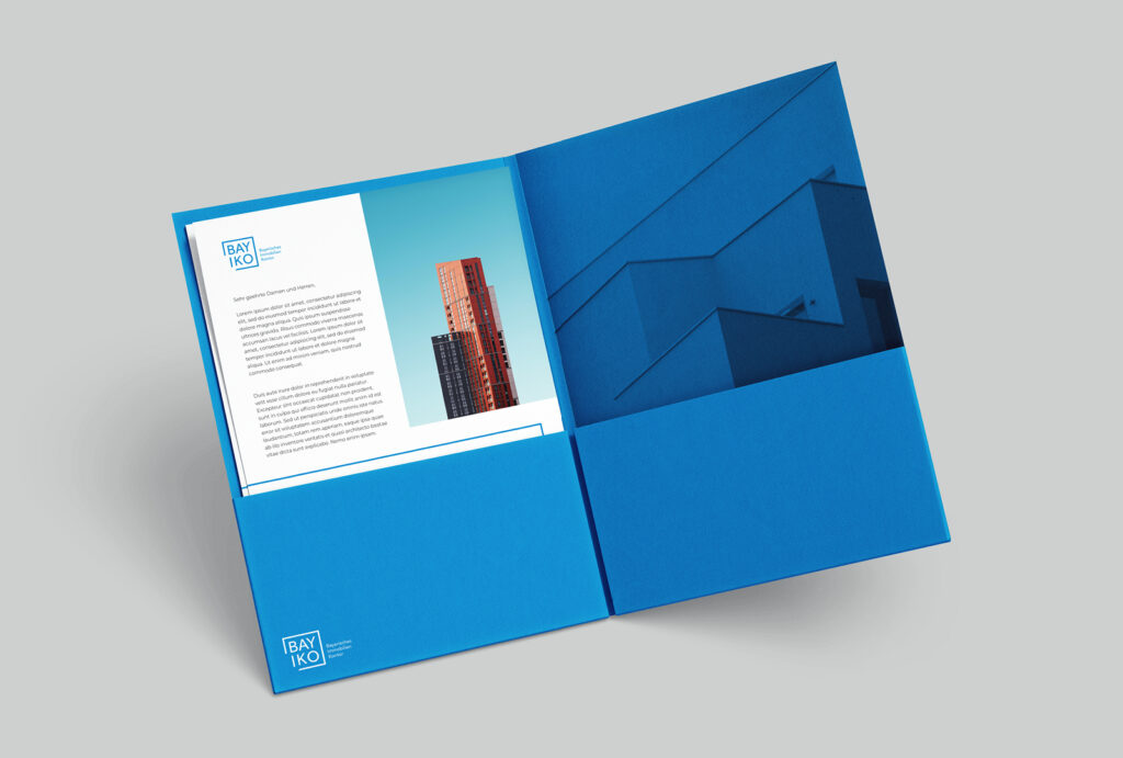
Some mockups to give a feeling for the corporate design of the brand.